Where they started
Unique Ride run chauffeur and airport transfer services across the London airports. The business was working. The presentation was not keeping up with it. The WordPress site looked dated, the fleet photography had been taken informally, and most of the technical groundwork search engines look for was missing.
The brief was not to go and find traffic. It was to make the brand look like the service actually is, and to put the foundations in place so that advertising, when it runs, has a credible destination.
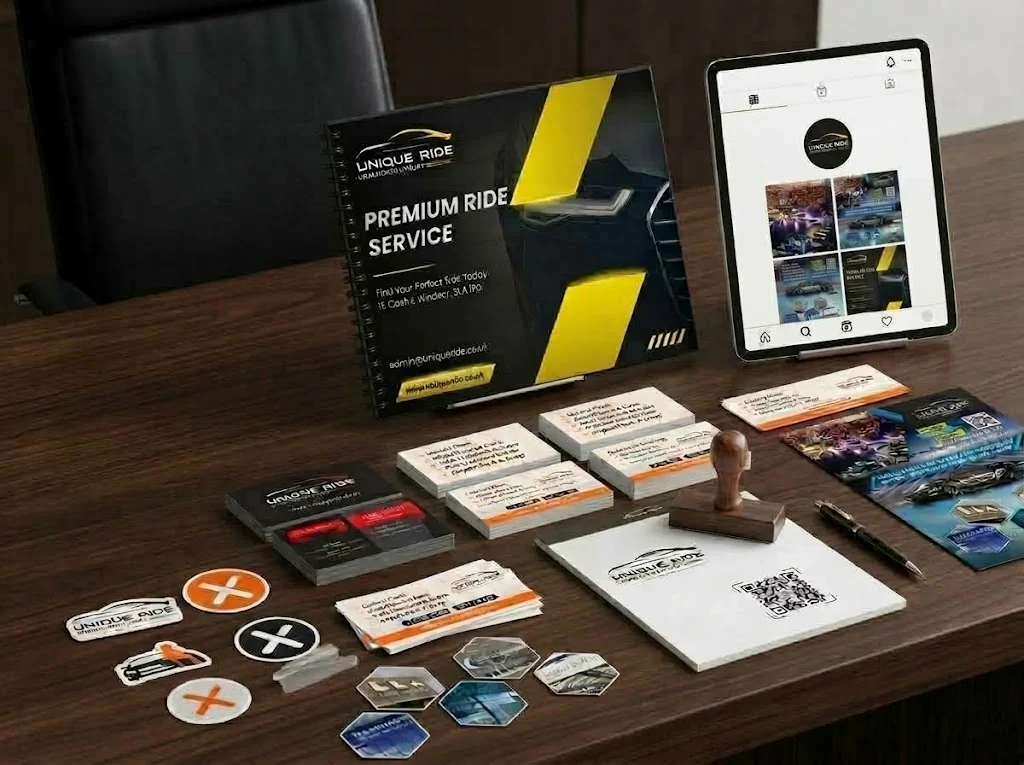
Brand and print
We started with the identity, then carried it through to the physical pieces the business puts in a customer's hand:
- Two business card specifications: 700gsm stock with gold foil for directors, 350gsm for the wider team
- Booking cards and stamps for day to day use
- Double sided A5 flyers on matte stock
- Branded stickers
- A full company profile document
The revamp
The site was rebuilt visually rather than replaced. The single biggest improvement was not technical at all. The fleet images had been photographed informally and undersold the cars, so they were replaced with proper high resolution photography. When your product is the vehicle, that one change alters how the entire page reads.
Alongside that we put the search foundation in: sitemaps, page structure, and the on-site technical items that were absent. On the audit tool we were tracking, the site moved from 8 to 82 across the thirty days.
Social
We then took on the social presence, producing the post designs, cover imagery and the content around them, so the brand holds together everywhere a customer might meet it.